
Decision
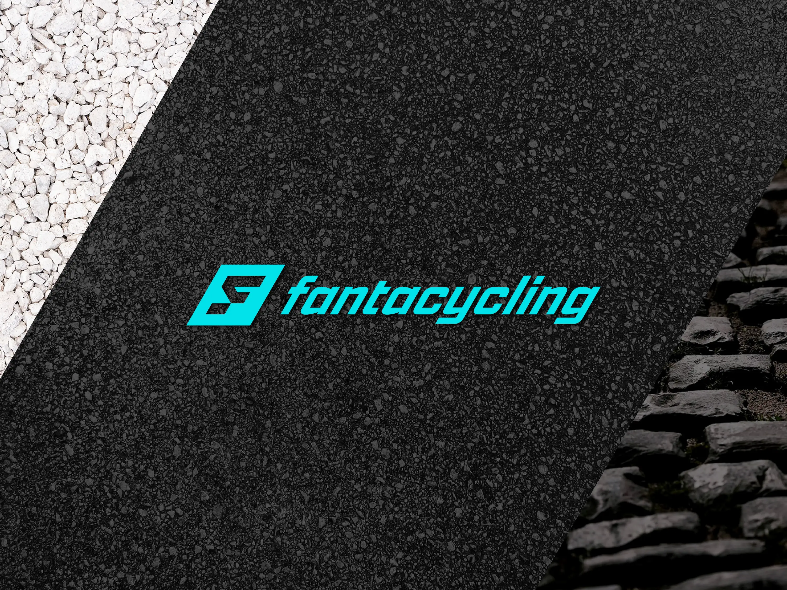
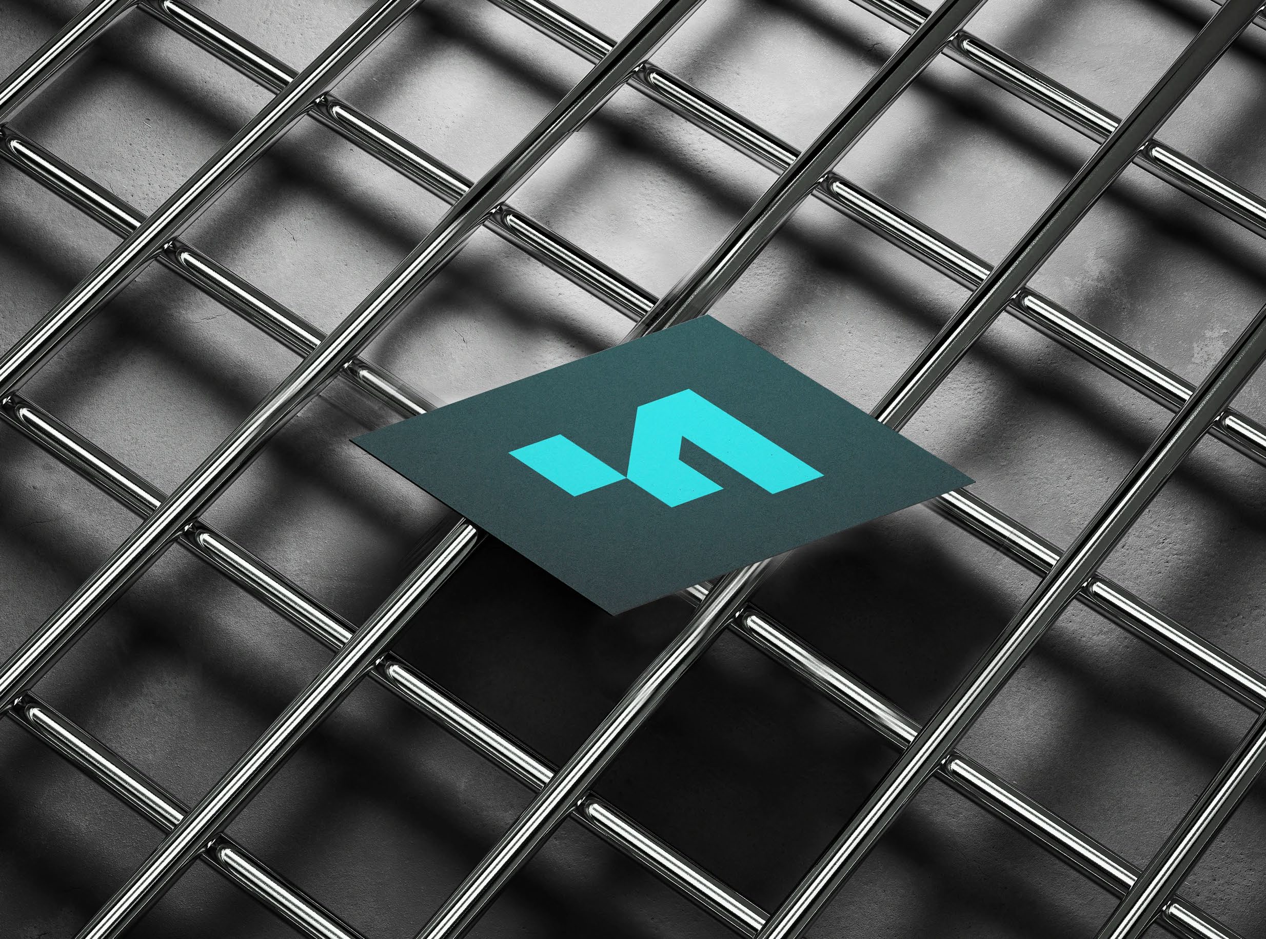
The new mark transforms the letter F into a symbol of speed and progression. A 30° geometry creates a visual language designed to express movement, ambition and performance across every touchpoint.


Outcome
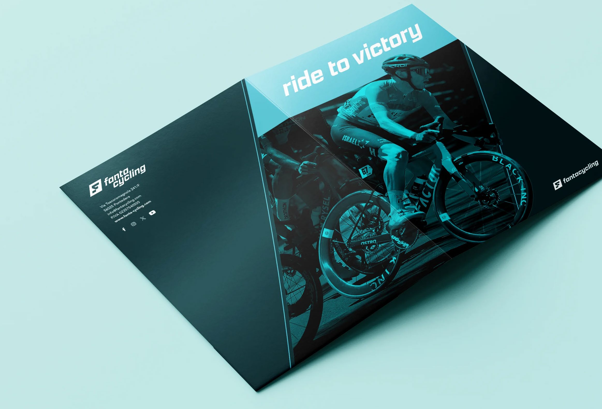
A coherent identity system applied to the website, mobile app and social communication, strengthening recognition and consistency throughout the brand experience.